

Category: Brand Identity & Activation Design
Year: 2021
This was a D&AD brief, set by VAT Superunion, was to create a brand identity for a local bike hire scheme based in a city of my choice. The goal was to develop a distinctive and engaging identity that reflected the city’s character while promoting accessibility and sustainability through cycling.
One of the first challenges was choosing a suitable location, as my local area didn’t have an existing bike hire scheme. I decided to base the project in Leeds, which required additional research into the city and its potential users. I also studied successful bike schemes in other cities to understand what made them effective, and visited local bike shops to explore different bike styles and branding approaches that could inspire my own design.
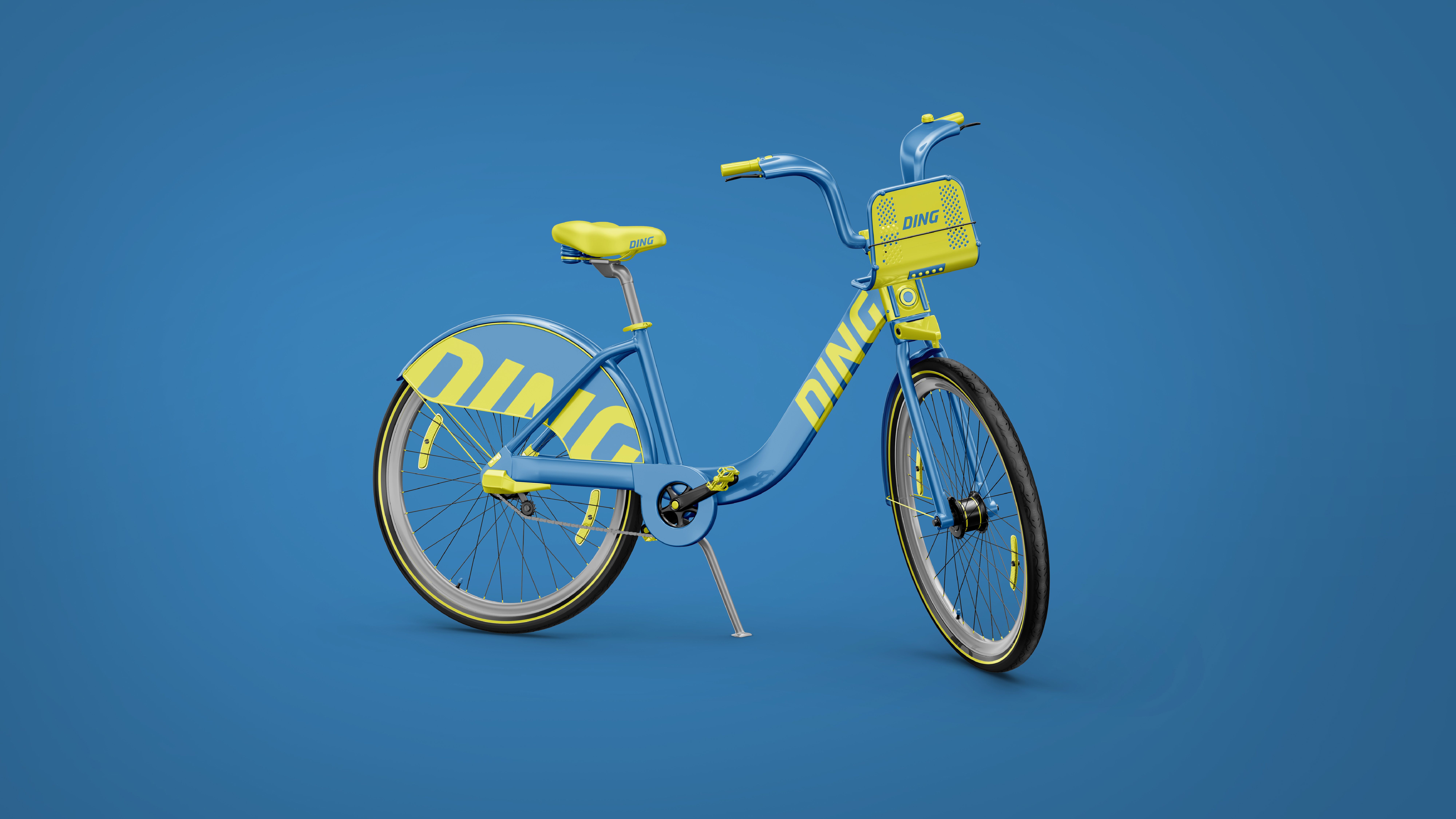
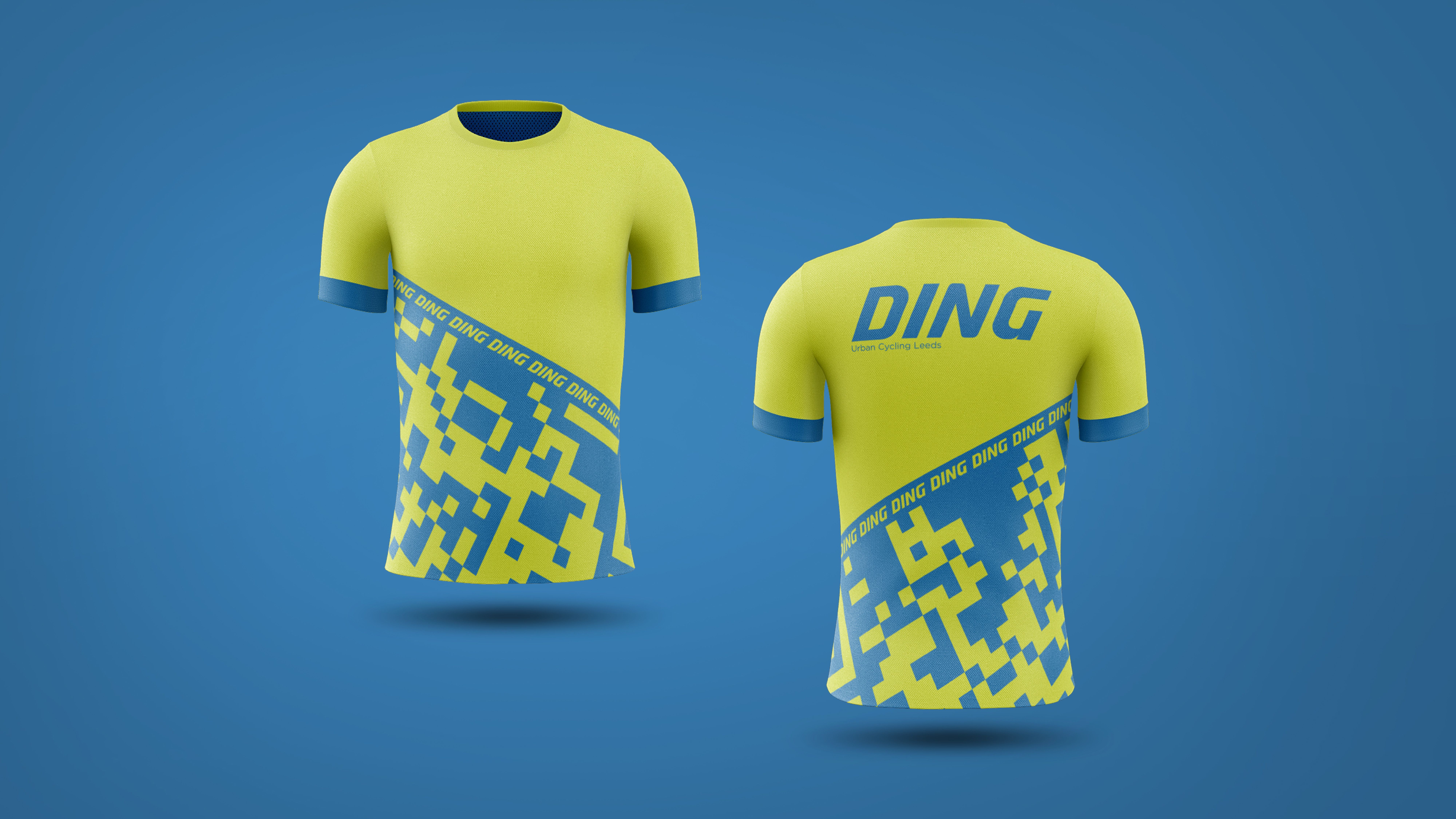
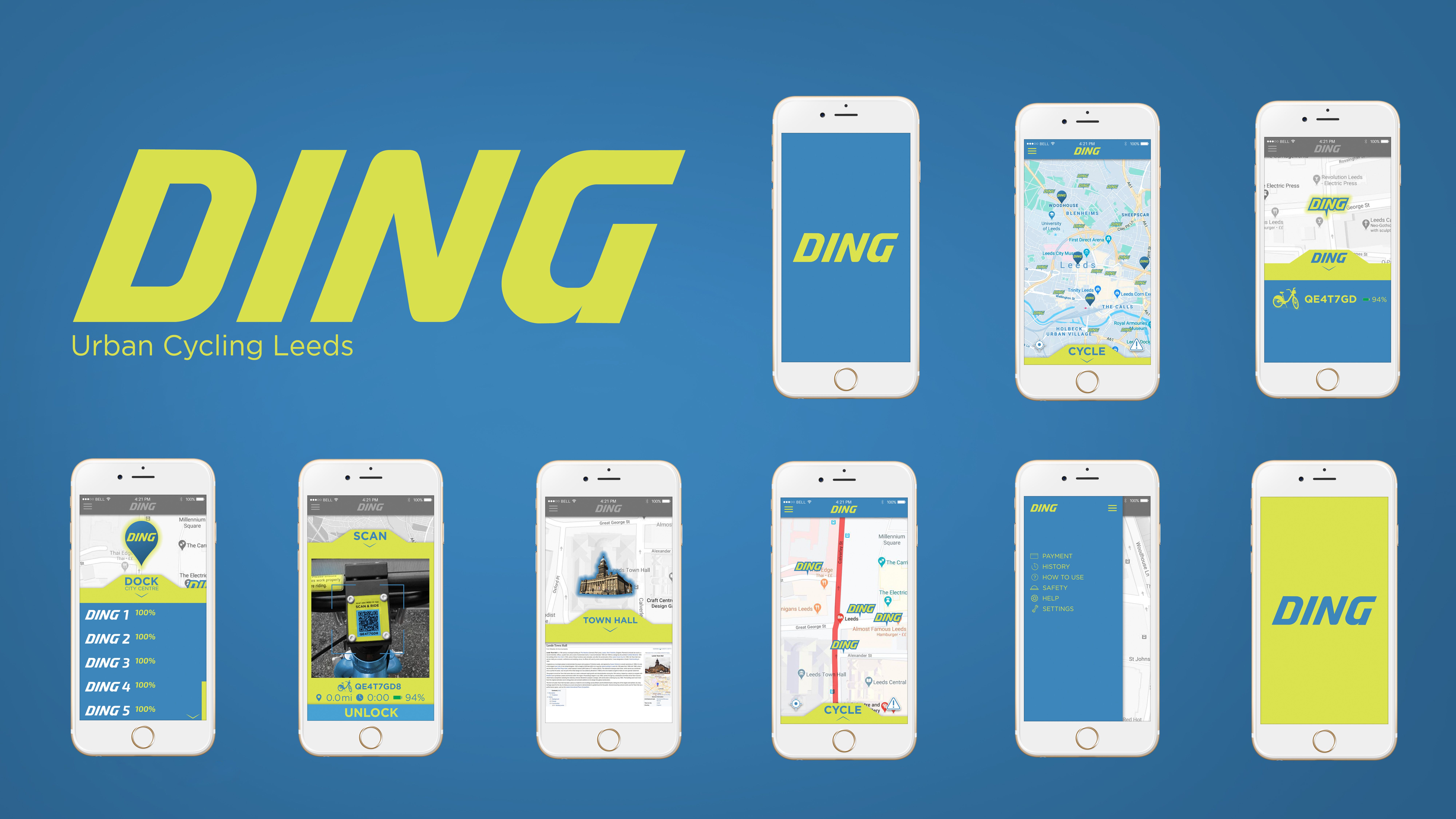
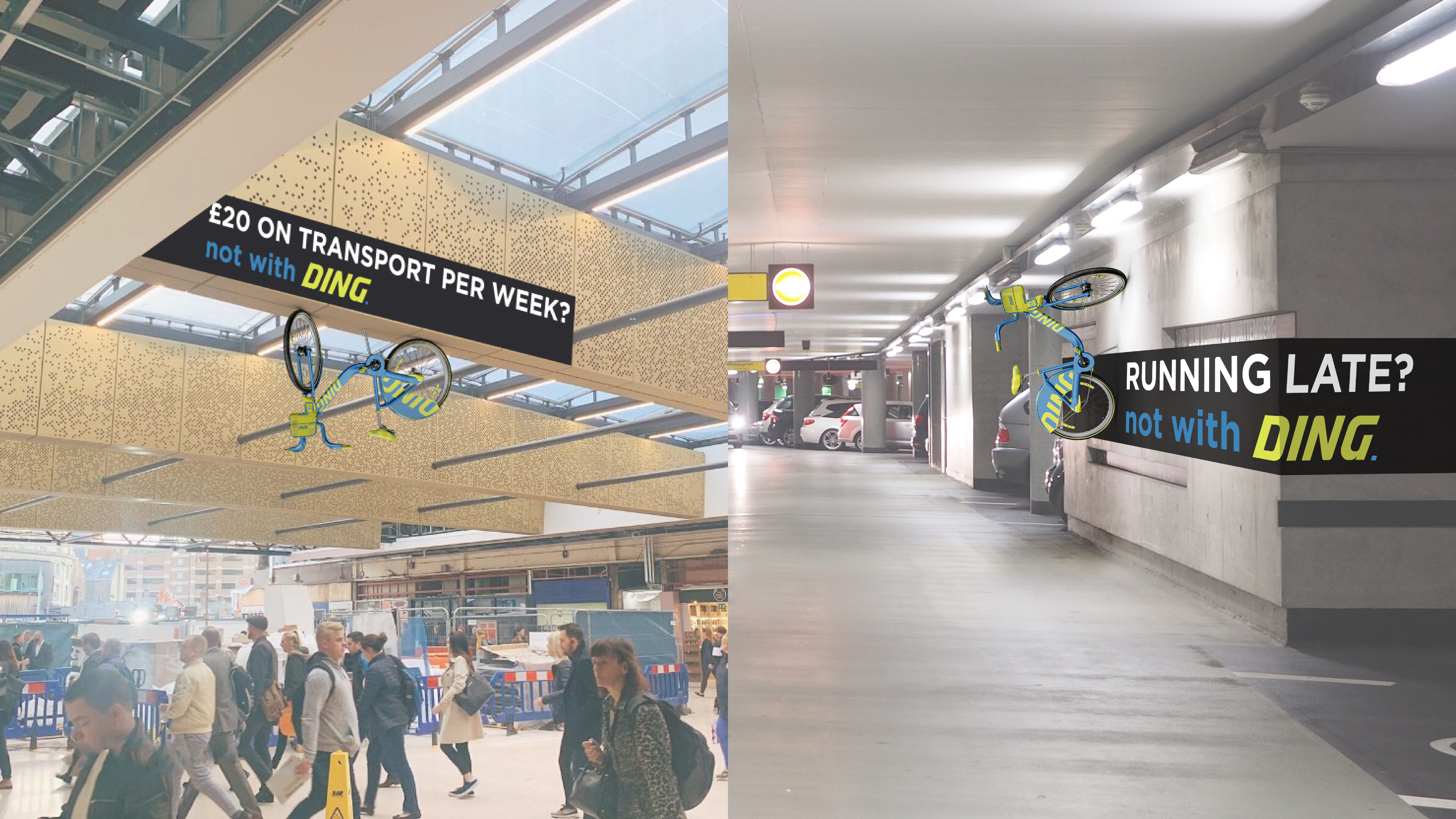
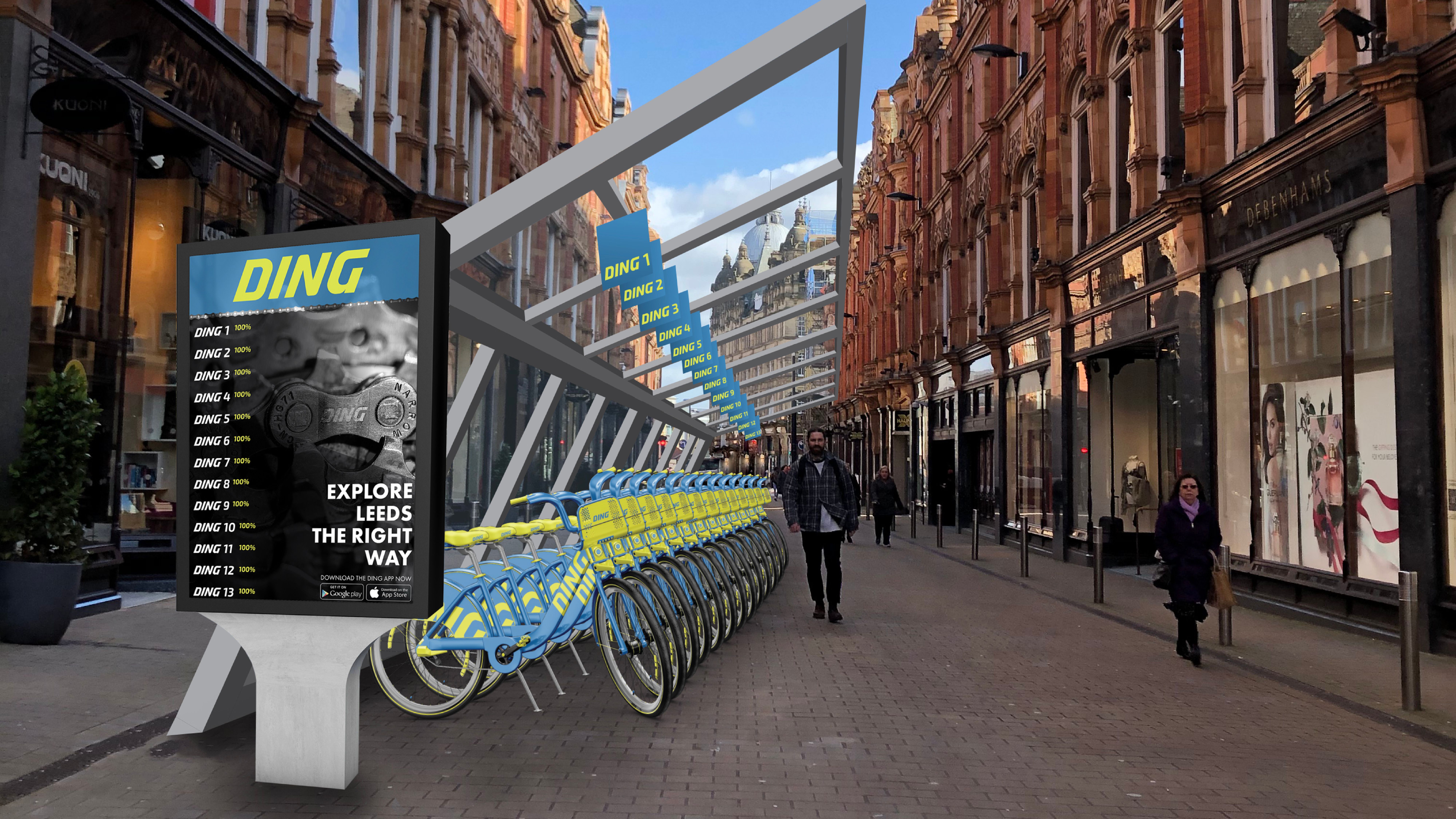
I developed the name, logo, and colour palette, choosing Ding for its memorability and yellow and blue to stand out outdoors. The logo was refined through type experimentation to feel unique yet approachable. I designed a digital bike stand and app, making it easy for users to find, rent, and navigate bikes. To launch the brand, I created an activation campaign with QR-inspired jerseys and city displays, showing that cycling with Ding is a simple, fun, and accessible way to get around.