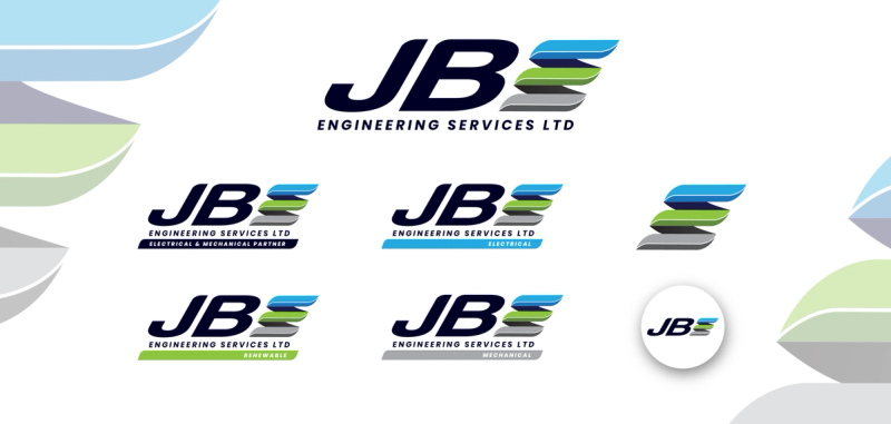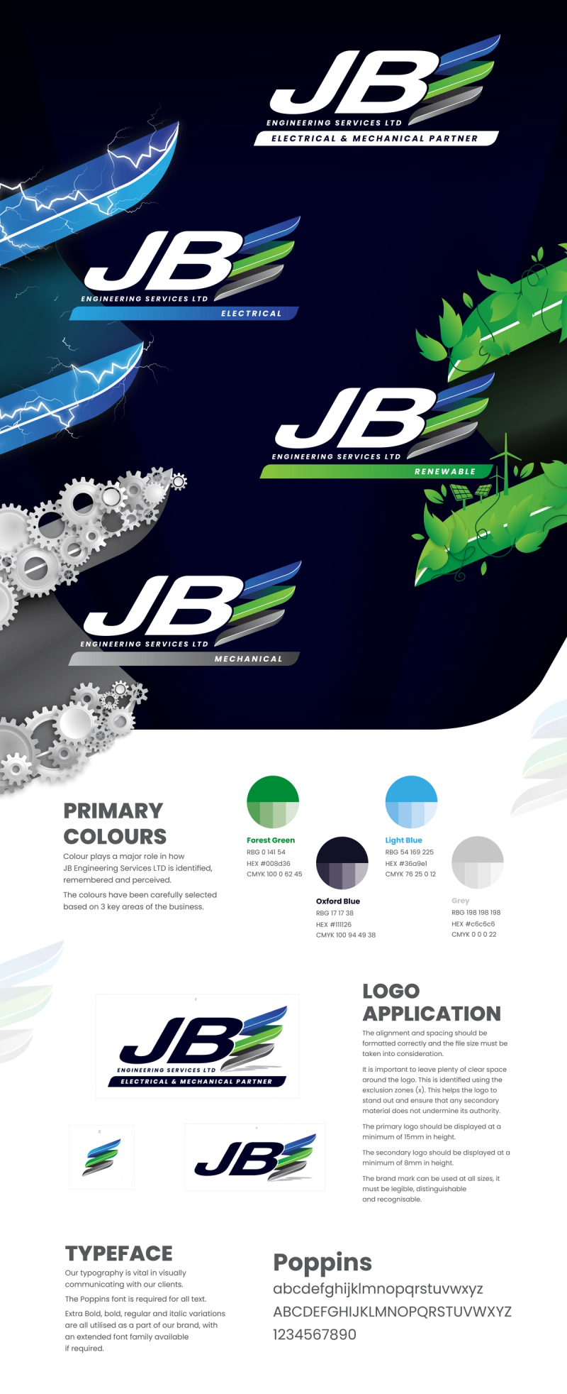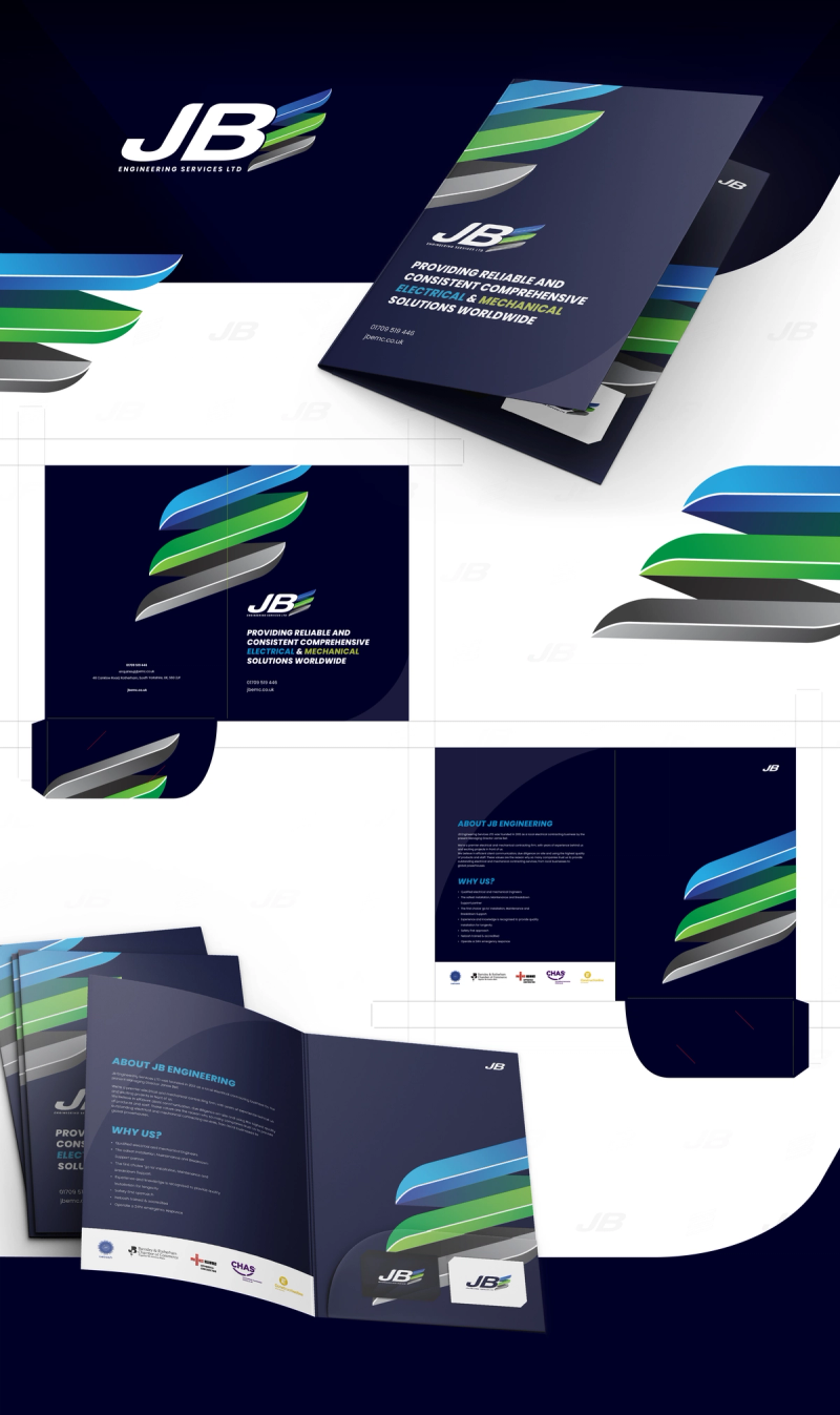

The first concept aimed to modernise JB Engineering’s logo with a cleaner, flat colour palette and flowing lines forming the letter E to represent Engineering. The goal was to refresh the brand while keeping it balanced and contemporary. After review, the client felt it moved too far from their original identity, leading to the refined final design below.


